September 12

You’re reading my mind, Apple …

So we’re a mixed household. Some Apple, some Windows, and a few Androids tucked away here and there.

Our digital data is similarly patched together: Some Amazon items, Google Play titles, and a lot of Apple TV content.

A recent announcement out of Cupertino really has me wondering if Apple is reading my mind.

When we see an interesting movie, we’re faced with a dilemma: rent it or buy it? Sometimes the prices are close enough that it’s a tough choice. Will we want to watch over and over again? Will we regret buying it? Will we pay almost double to rent it and then buy it?

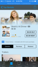
Take, for example, the movie Beatriz at Dinner. Currently, it’s $5.99 to rent, and $9.99 to buy.

We could rent it, love it, then buy it for a total of $15.98.

We could buy it, love it, and spend $9.99.

We could buy it, hate it, and have “rented it” for $9.99 instead of $5.99.

Yeah, I know, #firstworldproblems .

But here’s where they’re starting to read my mind. I’ve always wanted Apple to let you treat the rental price as a “try it before you buy it” option. Continue reading

Category: Apple, Data Architecture, future, hardware | Comments Off on You’re reading my mind, Apple …
September 27

Easter Eggs of a bygone era

I’ve been thinking of Easter Eggs I miss lately. Versions of software I’ve worked on where my name pops up on the second or third screen of contributors. A set of doors that would pop open when you closed them in a certain sequence at one place I worked (yes, like the West Wing episode).

But my favorite was in one of the original versions of the Apple Remote for the iPhone. If you hit the key sequence on the remote just right, (okay, fine, if you hit replay) you could put on a movie to play over and over and over again.

I loved it because I could put on a movie to fall asleep to. If I woke up, it’d still be on and I could drift back off. Handy to have before I got a white noise setup.

I kept hoping it’d be expanded, and you could use it to set up a playlist of shows or movies to just run.

Sadly, it’s now gone. I think the fourth or fifth update, someone nuked it. I can sort of understand why, and with the newer AppleTVs running iOS now, it might not have been long for this world, but it’s still something that might be useful. Set up a couple of episodes of this or that, let it run and repeat, especially for home movies. Truly an edge case scenario, but one that was pretty useful on nights when sleep was helped by a soothing replay of an old favorite movie.

Category: Apple, User eXperience | Comments Off on Easter Eggs of a bygone era
May 2

What a drag it is getting old

I’ve been yapping about the new Apple TV lately; mostly because I’ve been the one using the remote. Usually I just watch everyone else struggle with it and complain. And we aren’t all that old! Though we’re getting there.

It’s not that we fear change

Yeah, I hate it when things change. I was a diehard Windows 98 user. For a while you were not getting me away from WindowsXP. I still have Office 2003 installed on this very Windows 7 laptop. It really took a lot of being annoyed to recently request I have Office 2013 installed on my work computer if we ran out of other ways to fix the problem. And I got annoyed enough at “live photos” that I deactivated it as soon as I realized why my pictures were all “screwed up”.

But we aren’t all exactly like whomever is beta testing the hardware over at Apple’s main nerve center.

I realized this because I actually had to dig up and use the Apple TV remote to test my last couple of posts on this subject. “Dig up” because I don’t actually use it. We programmed the Apple TV to accept commands from my “dumb” IR TV remote.

Then I lost my “dumb” remote. Maybe with practice and no other options, I can learn to use the slick new Apple TV remote, but I really dislike the design and current use enough that I really don’t want to.

Annoying! The Apple TV remote is annoying.

Honestly, if I hadn’t been able to program the Apple TV to accept data from my “dumb” remote, I probably would never use the Apple TV at all. I’d watch things on my phone or read a book.

But if Apple follows my suggestions (or takes them and turns them into something even amazingly more funderful), we also have to remember the dumb remotes.

Just like one can set the click speed on a mouse or the touch sensitivity/help on an iPhone, do it on the Apple TV, too. For all kinds of remotes.

Siri, help me set up my remote

So you’ve done a few things to let us customize our experience, Apple, because you read my first two posts and shifted your agile teams into high gear to get right on it. Like one in fifty nerdly geeks have programmed in our favorite shortcuts and you have lots of data. Take that data, and use it to build onramp protocols for Siri to use.

Guide a user through a friendly questionnaire at first, to set up the most basic functions. If they want to “expand it”, walk through setting up long clicks or assistive clicks. Then, no matter what remote they use, (annoying Apple TV one, “dumb” IR remote, or their iPhone/iPod) they have a non annoying experience.

Don’t let Siri guess too hard

But don’t push it too far. Don’t let the “AI” style programming make all the decisions. Feel out what your users want, and ease them into it. It’s been about twenty years since someone taught me how to dial a cell phone (type in the number, press the green “send” button). I don’t like being told “this is the only way to do this”, but I also know we can’t fall into the trap of infinite customization. In that way lies madness … and I spent enough years trying to wrangle the madness of infinite customization into mere user guides for mere mortals.
Category: Apple, Free Beta Testers, hardware, User eXperience | Comments Off on What a drag it is getting old
April 28

Next on my list, Apple … UNDO! UNDO!

The night after I wrote up the post about looping us nerdy geeks into customizing our Apple TV software and doing all kinds of beta testing for your UX team, I fell asleep to a movie. Not too unusual; my days have been long as we get more sun and a great movie can help me wind down after a particularly productive day.

The next time I opened Apple TV ….

It wanted to show me my movie again. Which can be cool. I’m the kinda nerdling that can watch the same movie a couple times in a row. But getting out of the movie screen was …

Annoying!

Many many clicks, many many things. I could enumerate the steps but it’d require me falling asleep to Interstellar tonight. And remembering to amend this post in the morning. No thanks.

How about this?

  1. Click to wake up the Apple TV.
  2. Long-click the menu (reverse last order) button to pop all the way out back to the home screen.

Or double-click. Or triple click! Or whatever else I customize and record.

Just like last time, it would make this user happy. And it would make the process designer in me ecstatic. All those Apple TVs out there, and one in what, fifty super user geeks like me making their own design decisions? I can imagine getting my hands on that kind of data as a UX person: How the super user geek uses the Apple TV to improve the design for all users.

Come on, Apple. Give us some code! Beta nerds, beta testers, rah, rah, rah!


*I know that a lot of the architecture is very response based — so a lot of my ideas may not even be implementable. I’d have to crack open an SDK (if there is one) to even see if there’s an appropriate call and response or way to queue up commands so they aren’t “lost” as the Apple TV box takes its time loading up the right screen via the internet ….

Category: Apple, Free Beta Testers, User eXperience | Comments Off on Next on my list, Apple … UNDO! UNDO!
April 22

Waze should have laughed at me.

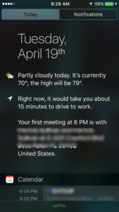
The privacy-aware side of me was a bit freaked out the first time my phone decided to let me know that if I left for work right now I’d probably be on time.

Information my phone gives me
“Shouldn’t you be heading out soon?”

It knew, though it didn’t know why, that I tended to do a weird morning routine. Loop through the school parking lot at 7:10, drive to the grocery store at 7:15 and park, do a loop-de-loop around the school parking lot again at 8:10, before finally heading into work by 9:00. Fuh-reak-y.

But carrying around a cell phone is a walking, talking, data-collecting elephant to begin with. What’s a little more data? That useful part of it makes the data and usability nerd in me happy.

Hyper-Realtime Traffic Info

I got to thinking about the head to head race I had this Easter Sunday. I was thinking about it as I was running errands at lunch, my usual use of that hour. Did I have time, I asked Waze, to skedaddle west eight miles and south ten miles to pick up paperwork from a medical office?

Waze assured me in it’s non-judgemental way that I’d be held up by rail crossing closures and heavy lunch time traffic. And, oh yeah, a huge festival (one of what, 50 this year?) that had a major arterial road blocked off for at least half a mile. I might make it ….

What it didn’t tell me, but I remembered in time, is that the office closes every day for lunch. I put that errand off for another day.

But what if Waze was hooked into NAP data, too?

I gave Waze the address of the place I wanted to go by sending it information I dug by hand from my contacts list. But what if I were able to send that info automatically? And put hours into my contact information for someone? Say, that the office opens at 9am and closes from 12:30 to 1:45 for lunch? We could Waze could read that, too, and then laugh at me tell me I was attempting a fool’s errand.

Or even better; if Waze was hooked into Google’s NAP data, with open and shut times? I wonder if it even supports “siesta” times? It’d be darn helpful if it did.

Category: Apple, Data Architecture, Google, User eXperience | Comments Off on Waze should have laughed at me.
April 15

What’s in a name? A Bluetooth by any other name would be so much sweeter.

I like having lots of Bluetooth devices. When I bought my Prius ten years ago, I figured I’d never need Bluetooth phone connection, so I didn’t upgrade to that package. Big mistake. Now Bluetooth rules my life and my devices.

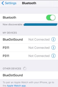
Image of iPhone Bluetooth options screen.
Even my backups have backups.

As you can see by the screenshot, I have BlueDotSound speakers. They’re pretty neat; they allow me to be LazyMom and wake the kids remotely. Click to connect to BDS, start streaming roosters and cool music to wake them up. Stream fog horns and The Itsy Bitsy Spider when they are moving too slow.

The P311s are pretty nice, too. Cute headphones (though I’ve worn the fake leather off of the ears). But I can’t tell which pair is the green and which pair is the black. Clicking to pick one on this screen is a crapshoot. Often times I’ll just delete them both, and go through pairing just to pick the “right” one.

I only have one BDS “discovered” at the moment. One is upstairs in the hall, and one is in one kid’s room. Keeping it “undiscovered” is a handy way to pick the right one every time at dark o’clock.

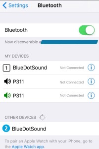
I’d rather, Apple, ahem, be able to name them.  But heck. My phone has a camera! What if you let me take pictures of the speakers, or something? Then I have a little teeny image to know which device to pick! If you don’t want to go that hog-wild, at least give us some image options that we can click to change …

Image of iPhone Bluetooth options screen with added icons.
Now I can tell the twins apart.
Category: Apple, Data Architecture, Free Beta Testers | Comments Off on What’s in a name? A Bluetooth by any other name would be so much sweeter.
April 12

20-20-24 hours a day … I wanna be in beta …

I suppose the UX folks finally were allowed to fix the “I own every episode” problem on the new Apple TV. Scrolling through eight or nine seasons of a show to find the newest episode was driving me insane.

I’d scratched together a post about it, then they went and dadgum fixed it. Yay, Apple!

But there are a few other things they can fix.

For example, take advantage of the touch technology on the remote and in the software:

  • Long clicks. It’s part of the newer iPhones, and the Apple TV remote.
  • Customizable actions.
  • Recordable actions.

Put them all together and you can fix something that annoys me … play movies without six zillion clicks.

  1. Click to select movies. Fine.
  2. Drag to move over to Purchased movies. Fine.
  3. Click to get to the point to look at the movies you own. FINE.
  4. Drag and click to select a movie to watch. Fine.
  5. Get shown the  splash screen of the movie. Play is highlighted.
  6. Click Play.
  7. THE MOVIE DOESN’T PLAY. You usually get taken to an ‘extras” interactive screen where you can click Play, or start thumbing through extras.
  8. Click Play.
  9. Half the time we are asked if we want to pick up the movie where we left off instead of actually playing the movie. Another Click.

Things are no longer fine.

How about this?

  1. Click to select movies.
  2. Drag to get over to Purchased movies.
  3. Click to get to the point you look at movies you own.
  4. Drag and long-click to select the move you want to watch and start playing it from the beginning.

Four steps instead of seven to nine. If I want to watch extras, I could double-click to get to the “extras” interactive screen. Or to play the movie where we left off. Or whatever else I customize and record. Or triple click to switch back to the Apple TV homescreen.

It would make this user happy. And it would make the process designer in me ecstatic. All those Apple TVs out there, and one in what, fifty super user geeks like me making their own design decisions? I can imagine getting my hands on that kind of data: How the super user geek uses the Apple TV to improve the design for all users.

Come on, Apple. Give us some code!

Category: Apple, Data Architecture, Free Beta Testers, User eXperience | Comments Off on 20-20-24 hours a day … I wanna be in beta …
April 10

We can be a bit … competitive around here

I’m a little bit of a usability and data architecture nerd. I hate it when an interface doesn’t work well, or there’s information stuck some place that can’t get some place else. When it all comes together, it’s a joy.

But that interest is secondary to my ingrained competitive spirit.

Anything you can do, I can do better …

Picture a quiet Easter Sunday afternoon. I’m in the car with a friend and we’ve got our near-matching iPhones at the ready. The goal? Find out what stores are open that carry the perfect water shoes for knee-deep island landings. The real goal? Beat the other guy at finding out what stores are open.

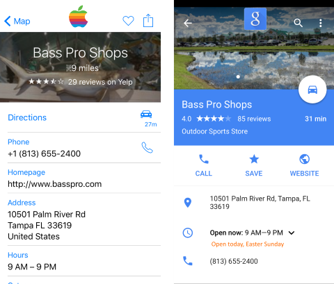
One of us used an Apple app, the other a Google app. Both of us got the same basic information … Name of the store, distance, time to drive, address, website, phone number, hours …

But the Google app’r had superior NAP data. This is something Google very very recently expanded, and is very very useful. While the Apple app’r was still making phone calls, the Google app’r was ready to go, armed with some pretty awesome local and holiday-specific info.

I’m glad this is something businesses can use, and big national businesses are using well (or poorly) …

It saved the Google app’r a lot of dialing to businesses that were not open, driving to businesses that were not open, and aggravation. We went straight to the store we wanted — and yes, dear reader, we did find the perfect water shoes.

Note: All images are simulated because we were too busy squaring off forgot to take screenshots right then.

image of map and data shots from navigation apps
When two apps want to share data very very much …
Category: Apple, Data Architecture, Google, User eXperience | Comments Off on We can be a bit … competitive around here
March 7

I hope someone at Apple is spying on us.

I was one of the dozens in my circle who had hoped the iOS 7 user interface preview was a joke. It is, and it isn’t.

Sure, I’m not young any more, and I’m not that old. But the super skinny UI and flat, plain jane, moving default interface? Yeeech. What a joke.

I’ve just updated to iOS 7.0.6 in the hopes of fixing something with one of my gadgets that syncs to it. No dice, but I’ll troubleshoot the other device some other time.

While I was poking around the settings, I realized I had made the UI as non-nauseatingly still and as big and bold as reasonable. I wondered – how many other people have done this to their phones?

One order of data mining, please.

Apple may find it difficult to capture this information on Jailbroken iDevices (Are there alternate UI schemes? Might be worth it to Jailbreak after all …) but surely the are watching the rest of us good doobies playing in their walled garden. If enough of us have turned on this functionality to disable the crap, maybe they’ll change it?

Category: Apple, User eXperience | Comments Off on I hope someone at Apple is spying on us.