April 19

Organic Bouquet, why can’t I quit you?

This email was sent by: Organic Bouquet
555 Winderley Place Suite 129 Maitland, FL, 32751, USA

You were sent this message because you previously expressed interest in Organic Bouquet or Organic Style. If you no longer wish to receive our e-mail advertisements, simply unsubscribe.

Please do not reply to this e-mail as we are not able to respond to messages sent to this address. For further questions, please email customerservice@organicbouquet.com.

I’ve got about 300 emails not yet deleted, dating back to 2011. Every few months I click “unsubscribe” and it tells me I’ve unsubscribed and how sorry they are to see me go.

And then a few days later, I get another email ….

I’ve called. I’ve emailed. I’ve clicked to unsubscribe.

Organic Bouquet, why can’t I quit you?

Image of a long list of emails from Organic Bouquet.
National Smoke & Mirrors day, you say?
Category: fix it already, User eXperience | Comments Off on Organic Bouquet, why can’t I quit you?
April 12

20-20-24 hours a day … I wanna be in beta …

I suppose the UX folks finally were allowed to fix the “I own every episode” problem on the new Apple TV. Scrolling through eight or nine seasons of a show to find the newest episode was driving me insane.

I’d scratched together a post about it, then they went and dadgum fixed it. Yay, Apple!

But there are a few other things they can fix.

For example, take advantage of the touch technology on the remote and in the software:

  • Long clicks. It’s part of the newer iPhones, and the Apple TV remote.
  • Customizable actions.
  • Recordable actions.

Put them all together and you can fix something that annoys me … play movies without six zillion clicks.

  1. Click to select movies. Fine.
  2. Drag to move over to Purchased movies. Fine.
  3. Click to get to the point to look at the movies you own. FINE.
  4. Drag and click to select a movie to watch. Fine.
  5. Get shown the  splash screen of the movie. Play is highlighted.
  6. Click Play.
  7. THE MOVIE DOESN’T PLAY. You usually get taken to an ‘extras” interactive screen where you can click Play, or start thumbing through extras.
  8. Click Play.
  9. Half the time we are asked if we want to pick up the movie where we left off instead of actually playing the movie. Another Click.

Things are no longer fine.

How about this?

  1. Click to select movies.
  2. Drag to get over to Purchased movies.
  3. Click to get to the point you look at movies you own.
  4. Drag and long-click to select the move you want to watch and start playing it from the beginning.

Four steps instead of seven to nine. If I want to watch extras, I could double-click to get to the “extras” interactive screen. Or to play the movie where we left off. Or whatever else I customize and record. Or triple click to switch back to the Apple TV homescreen.

It would make this user happy. And it would make the process designer in me ecstatic. All those Apple TVs out there, and one in what, fifty super user geeks like me making their own design decisions? I can imagine getting my hands on that kind of data: How the super user geek uses the Apple TV to improve the design for all users.

Come on, Apple. Give us some code!

Category: Apple, Data Architecture, Free Beta Testers, User eXperience | Comments Off on 20-20-24 hours a day … I wanna be in beta …
April 10

We can be a bit … competitive around here

I’m a little bit of a usability and data architecture nerd. I hate it when an interface doesn’t work well, or there’s information stuck some place that can’t get some place else. When it all comes together, it’s a joy.

But that interest is secondary to my ingrained competitive spirit.

Anything you can do, I can do better …

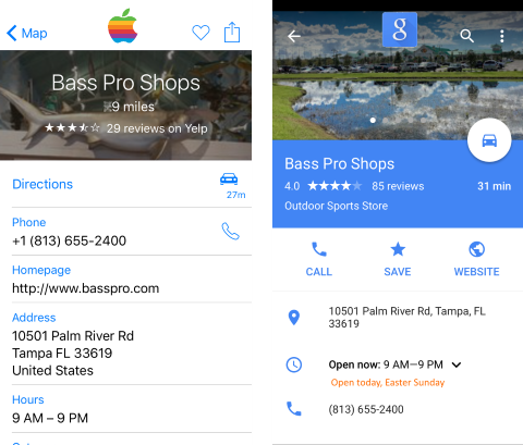
Picture a quiet Easter Sunday afternoon. I’m in the car with a friend and we’ve got our near-matching iPhones at the ready. The goal? Find out what stores are open that carry the perfect water shoes for knee-deep island landings. The real goal? Beat the other guy at finding out what stores are open.

One of us used an Apple app, the other a Google app. Both of us got the same basic information … Name of the store, distance, time to drive, address, website, phone number, hours …

But the Google app’r had superior NAP data. This is something Google very very recently expanded, and is very very useful. While the Apple app’r was still making phone calls, the Google app’r was ready to go, armed with some pretty awesome local and holiday-specific info.

I’m glad this is something businesses can use, and big national businesses are using well (or poorly) …

It saved the Google app’r a lot of dialing to businesses that were not open, driving to businesses that were not open, and aggravation. We went straight to the store we wanted — and yes, dear reader, we did find the perfect water shoes.

Note: All images are simulated because we were too busy squaring off forgot to take screenshots right then.

image of map and data shots from navigation apps
When two apps want to share data very very much …
Category: Apple, Data Architecture, Google, User eXperience | Comments Off on We can be a bit … competitive around here
April 7

Infinite Customization is Infinite

One problem I’ve run into over the years is the fact that are six thousand ways to do things. Sometimes it’s great, sometimes it sucks. Lately it’s been LinkedIn driving me crazy. So many ways to like and unlike things.

Which is fine, if you aren’t trying to do drive-by social media engagement. Click to “like” something you shouldn’t and you may need to scramble to figure out how to fix it.

Today I found another one. There’s a lot of suggestions out there to never ever use the “generic” LinkedIn message to make a connection, but I blew it.

I’d like to add you to my professional network on LinkedIn.”

And what did I do? I accidentally sent two colleagues the generic LinkedIn request … because I used LinkedIn’s app instead of their website.

If I had one teeny little request for the LinkedIn UX team, it would be to add in the ability to change that generic message on the app … or at least stop the request from going out until you can get to a real browser.

Category: User eXperience | Comments Off on Infinite Customization is Infinite
February 11

I’ve got too much going on in my browser window.

Right now, I’ve got fourteen tabs open. In this Chrome window. I’ve got two others open because I’m trying to teach myself to plan project using Trello, and copying things from one board to the other.

My cell phone is worse. When I last “closed out my browser” I got myself from ninety open tabs down to ten. I’m back up to about thirty.

I know I’m not the only one; friends with similar thinking styles do the same thing. The earth-shattering moans you hear from time to time are us inadvertently not clicking “restore” after a Chrome crash. (Not sure if other browsers have similar functionality.)

There are “apps” to presumably take care of saving things to read later and presenting them to me. I’ve yet to find one that works for all the sites I browse, or is easy enough to use on the phone or computer (preferably both). So I end up emailing myself my tabs. Crude. Slow.

Then I thought … why not a bulk emailer? A simple click. “Email me all my open tabs at designated email address.” A plug in for Chrome (or built in to the phone browser). Click, done. Like a daily brain summary.

Another reason I should learn to code, I guess. EdgeCase Industries, ladies and gentlemen! Curated apps for everyone!

Category: User eXperience | Comments Off on I’ve got too much going on in my browser window.
April 11

“Fixing” my Nook library “problem” with hardware

Ooops! We have some kind of error!

I decided to buy the kids a few more books this month. But after going to the trouble of “archiving” all of the books that aren’t kid-friendly to put the kid-friendly ones on the Nook Simple Touch, I found another solution.

Hardware.

I simply nuked the Nook, removing it from my account. Then I hooked it back up, yanked the wireless service just after it re-registered, and left a library full of not-downloaded books on there.

Next, I navigated to my Nook library online, and started downloading what kid books I could to a memory card.

Last, I dropped the card into the Nook. Now the kids (when you sort by the Recent criteria) see the kid books put there for reading. They can see the titles of “my” books, but read what’s theirs. And it’s next to nothing to pop the card out, drop a book they want on to it, and pop it back in the device.

A bit of a kludge, but it works.

Now all I need to do is figure out why so many books have a “download” button when they can’t actually download via the browser, and why some have a link and others a button …

Meantime, any guesses what the error at the start of this entry is?

Category: Nook, User eXperience | Comments Off on “Fixing” my Nook library “problem” with hardware
March 7

I hope someone at Apple is spying on us.

I was one of the dozens in my circle who had hoped the iOS 7 user interface preview was a joke. It is, and it isn’t.

Sure, I’m not young any more, and I’m not that old. But the super skinny UI and flat, plain jane, moving default interface? Yeeech. What a joke.

I’ve just updated to iOS 7.0.6 in the hopes of fixing something with one of my gadgets that syncs to it. No dice, but I’ll troubleshoot the other device some other time.

While I was poking around the settings, I realized I had made the UI as non-nauseatingly still and as big and bold as reasonable. I wondered – how many other people have done this to their phones?

One order of data mining, please.

Apple may find it difficult to capture this information on Jailbroken iDevices (Are there alternate UI schemes? Might be worth it to Jailbreak after all …) but surely the are watching the rest of us good doobies playing in their walled garden. If enough of us have turned on this functionality to disable the crap, maybe they’ll change it?

Category: Apple, User eXperience | Comments Off on I hope someone at Apple is spying on us.