Designing your mobile game to flail: A look at the UX in PokémonGO
Years and years ago, there was a really great Super Bowl ad for a job site called monster.com. The premise was kids dreaming aloud of grown up jobs, but speaking of their dreams in ridiculous terms. The one that resonated most with me at the time was a dead serious tween: “I want to file all day.” Nobody wants to file all day.
And this goes for gamers, too. The equivalent of filing in video games is organizing and maintaining your inventory. Chasing through ridiculous amounts of menus just sucks the enjoyment right out of the game. No gamer is thinking to themselves: “I want to click through menus all day.”
But that is exactly what you do in PokémonGO. Click through unnecessary menus all darn day. It hurts gameplay, and I bet it’s even suppressing recurring player counts.
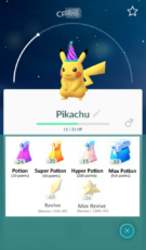
I’ve been playing PokémonGO on and off since it’s public release. There have been some changes to the “capture” side of the gameplay that are fantastic. Improvements to the “battle” side of the gameplay experience are still lacking, however.
Capture Gameplay Improvements:
- Sliding Capture Menus
- Appraisal function on the secondary character screen
- Buddy System